Project Overview
Cleveland 311 existed for about 15 years as a call center, answering calls for information and fielding service requests under shifting names and minimal public visibility. It lacked an identity and had never been meaningfully marketed.
Cleveland 311 existed for about 15 years as a call center, answering calls for information and fielding service requests under shifting names and minimal public visibility. It lacked an identity and had never been meaningfully marketed.
The relaunch of Cleveland 311 wasn’t just a rebrand—it was a transformation. Alongside the new identity, the city introduced a customer management system and public-facing website, allowing residents to submit requests in one place and have them automatically routed to the appropriate team.
The launch of Cleveland’s new 311 technology brings the city in line with peer cities that have long treated 311 as a building block of accessible, responsive local government.
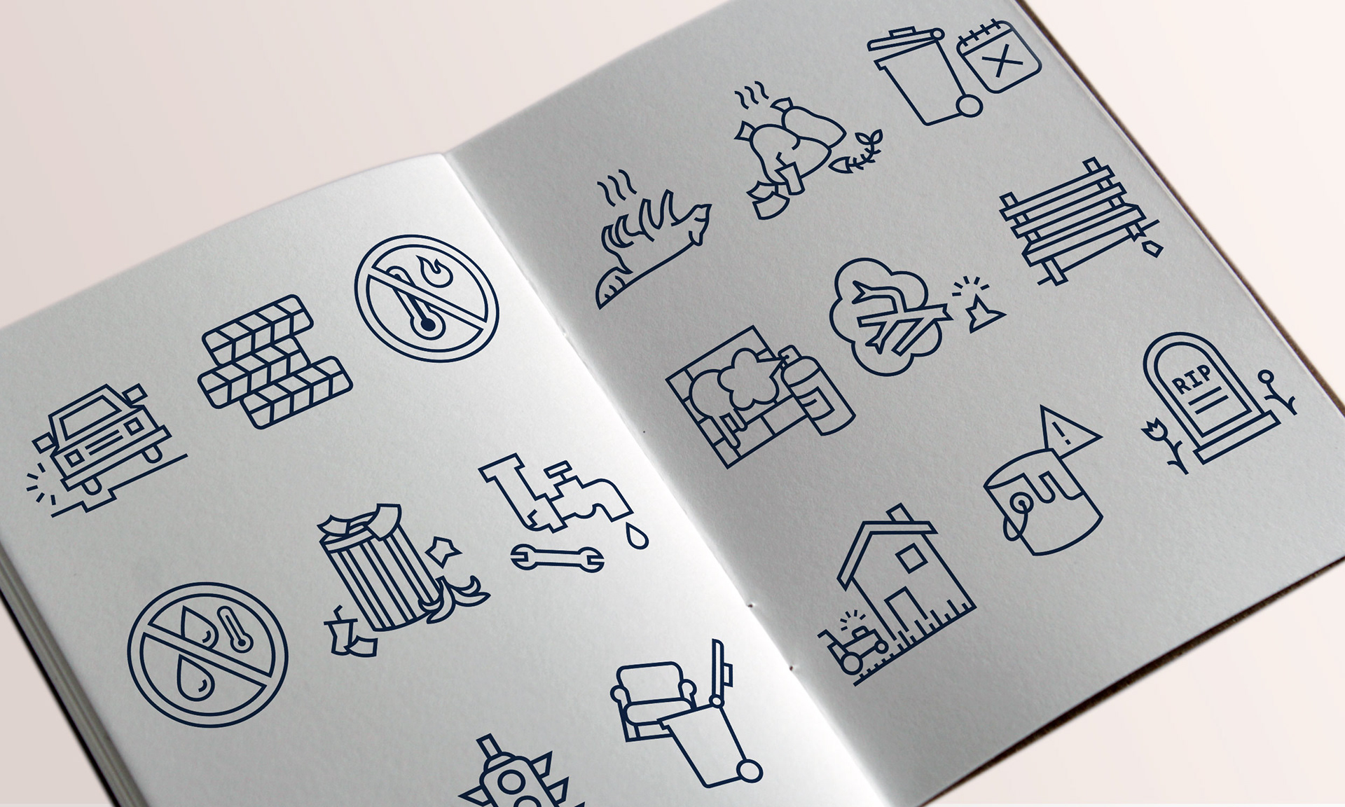
Each service request has a representative icon
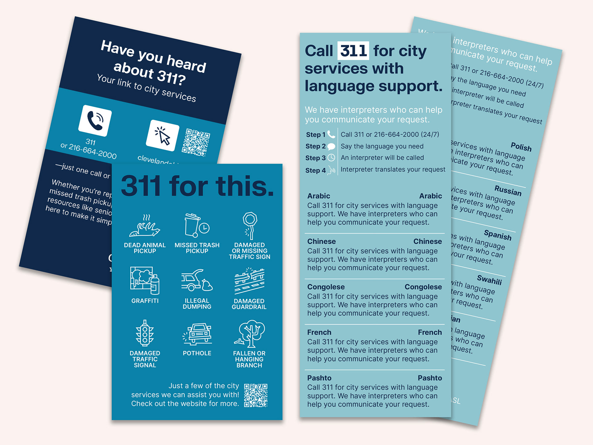
Selected print collateral
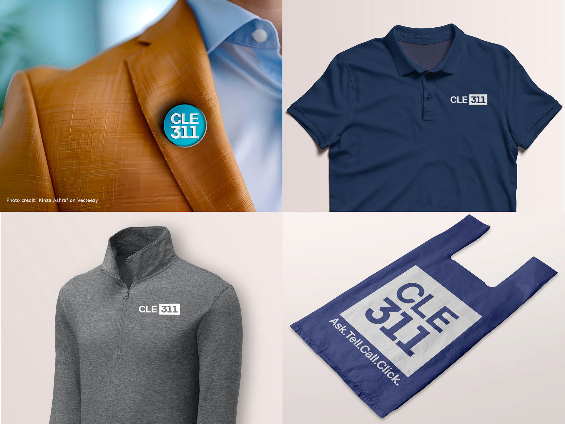
First round of apparel and swag
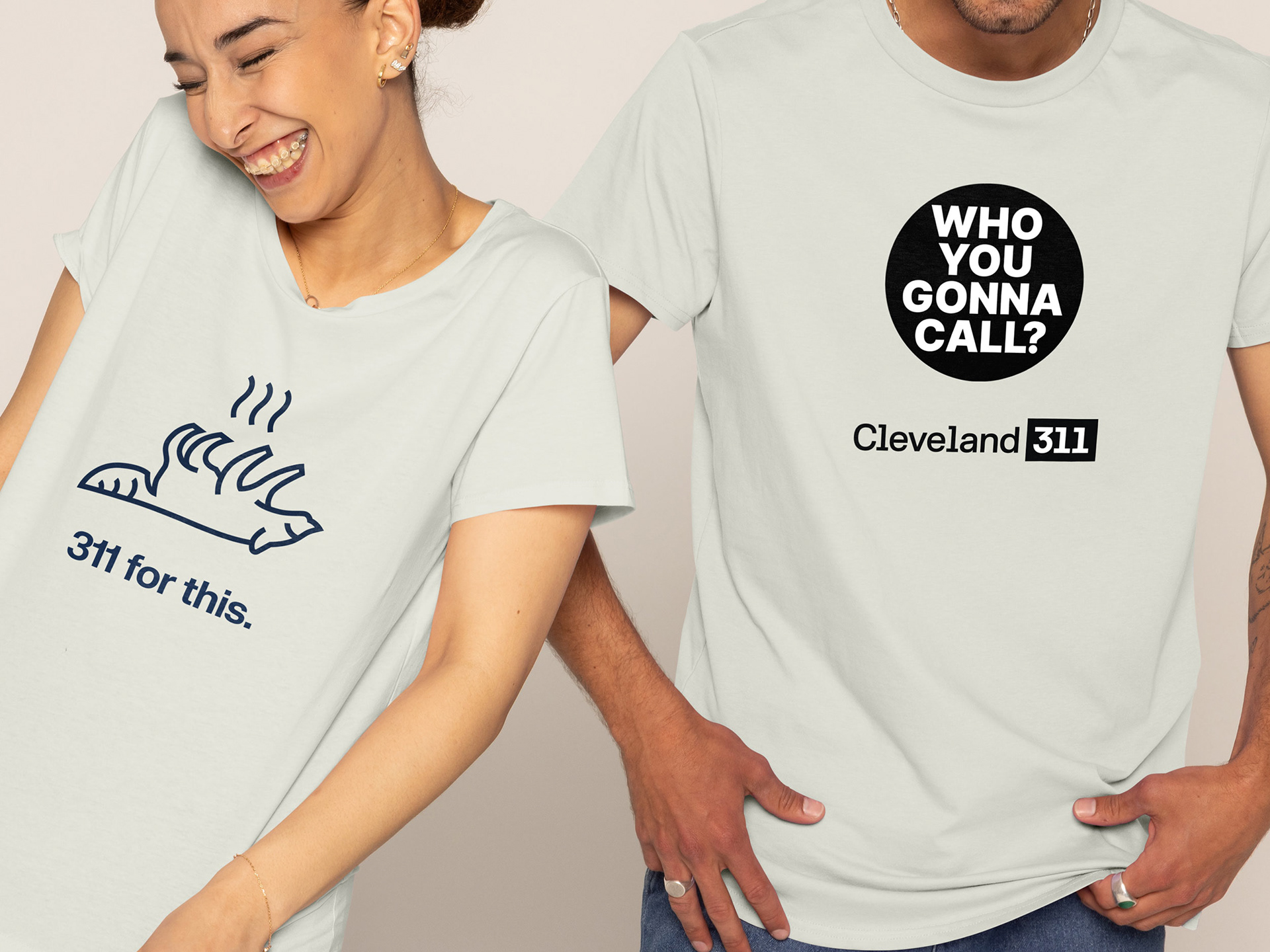
New t-shirts for 2026
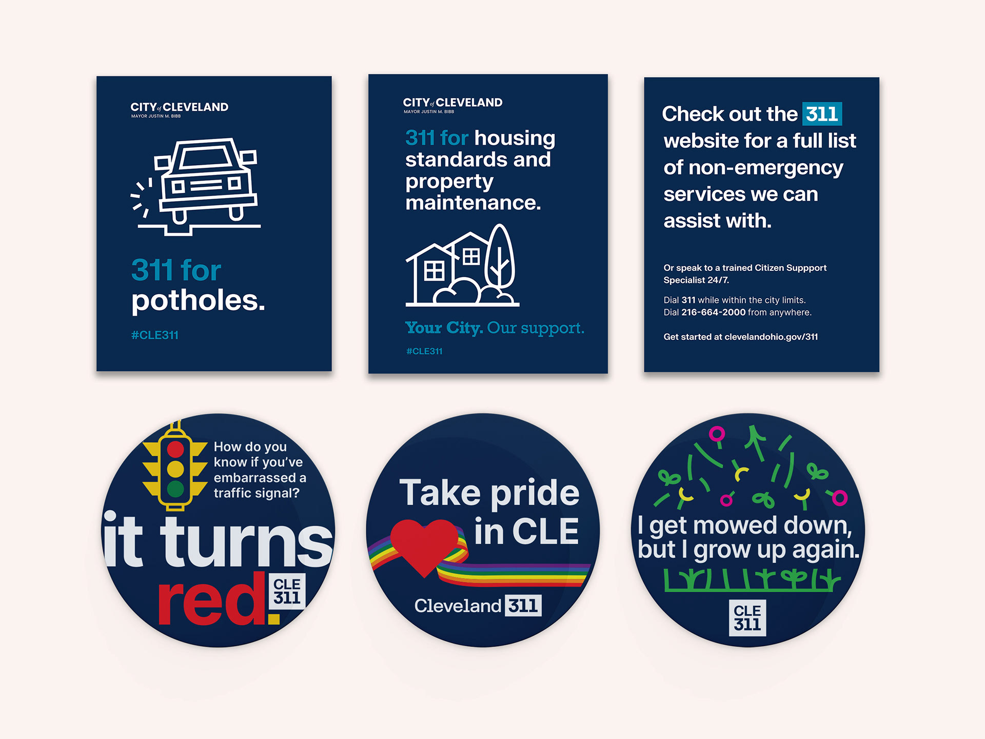
Selected social posts and brand new stickers
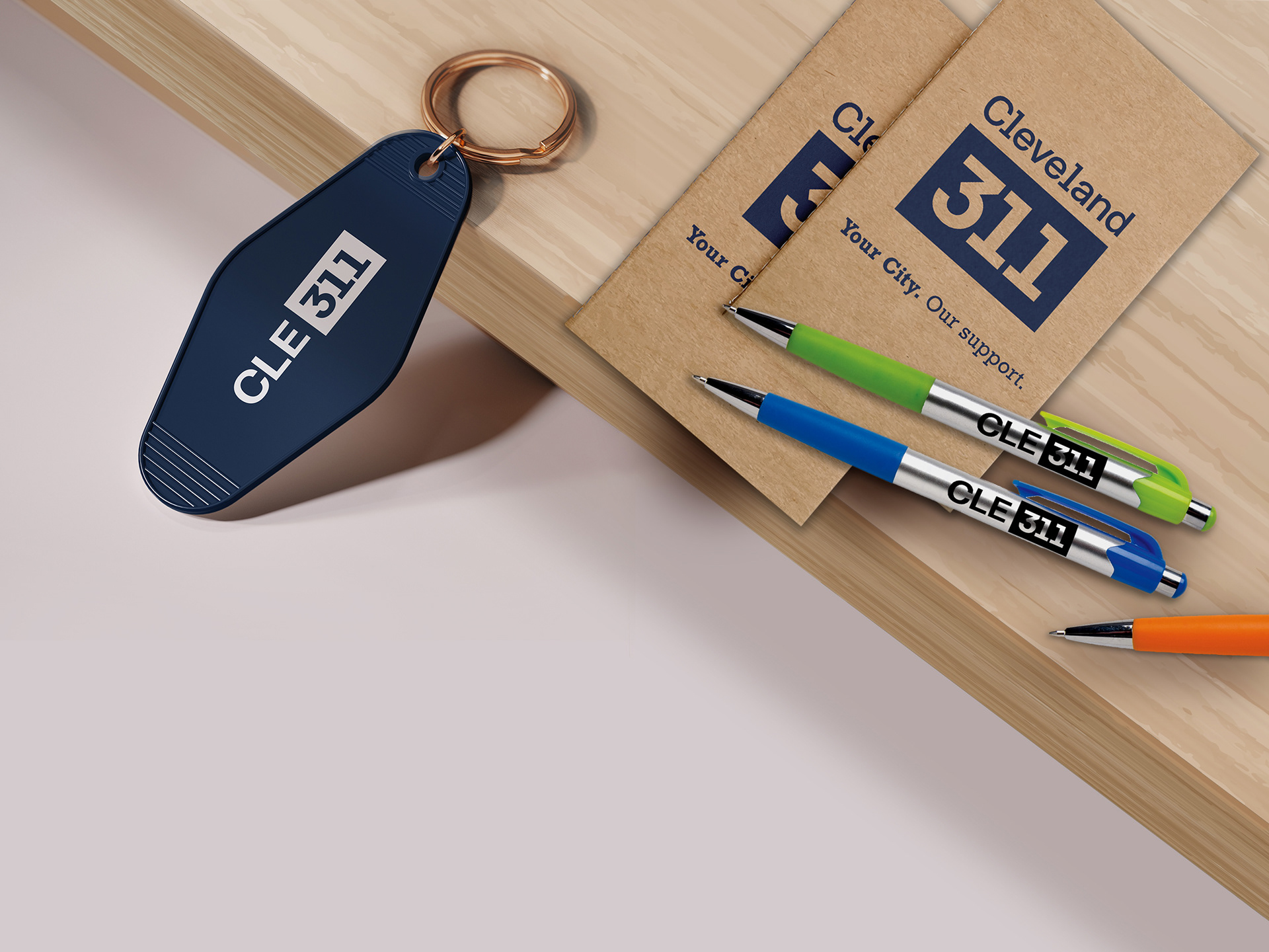
Sample of promotional items
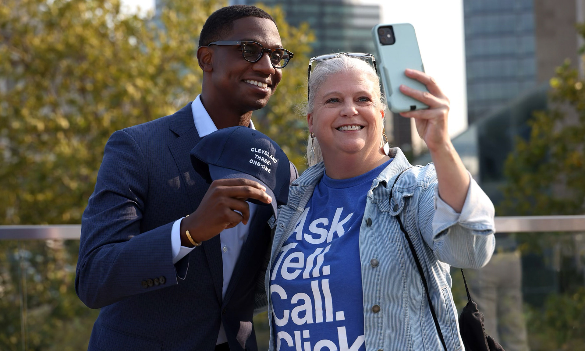
Grabbing a selfie at the launch with Mayor Bibb
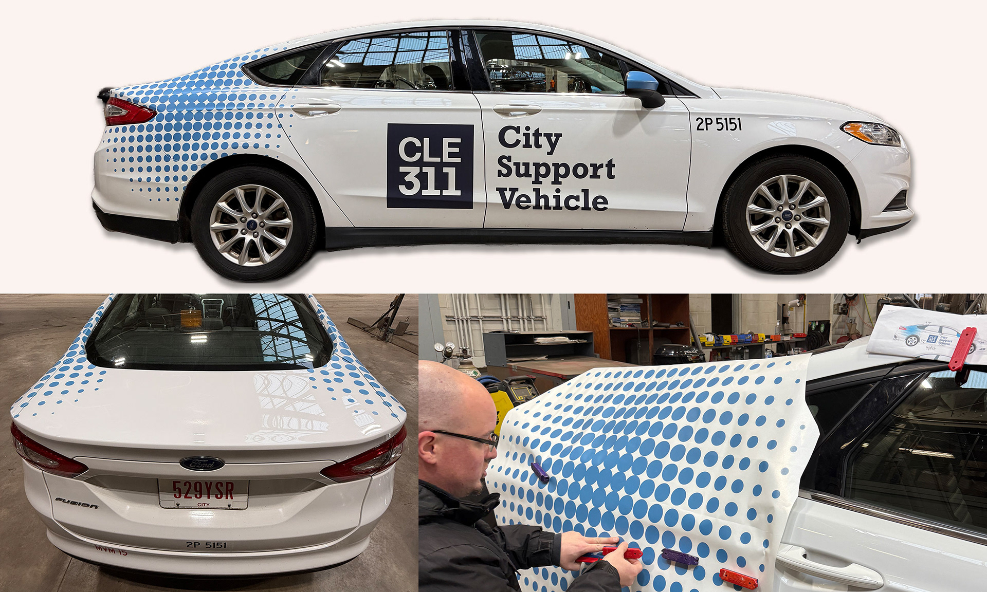
Vehicle wrap for our new City Support Vehicle
Digital Ike
How To motion animation
For display monitors throughtout City Hall and recreation centers
The Challenge
There was a low level of public awareness of 311 and its actual function. Behind the scenes, there was no system in place: service requests were routed through phone calls to department directors, scribbled on sticky notes, or lost in email chains. There was no centralized way to track issues or ensure follow-through. This less-than-reliable method led to the perception of city services as slow, impersonal, or ineffective.
There was a low level of public awareness of 311 and its actual function. Behind the scenes, there was no system in place: service requests were routed through phone calls to department directors, scribbled on sticky notes, or lost in email chains. There was no centralized way to track issues or ensure follow-through. This less-than-reliable method led to the perception of city services as slow, impersonal, or ineffective.
My Role
Designer / Brand and Marketing Strategist / Project Manager
This entire project was the team effort of a small group of city staff and collaborators. At the core, it was my director and I who shaped the vision and drove the direction from concept to launch and beyond. I stepped into roles well beyond traditional design—bridging gaps across branding, marketing, and project management – hands-on creative leadership, and other hats as needed.
While I led much of the initial design and concept development of 311, we also brought in a marketing firm to support the rollout. I worked closely with their team—providing strategic direction, adapting and refining assets, and expanding on their work where it didn’t fully meet the needs of our audience or goals.
Strategy & Approach
The Mayor’s Office wanted 311 to be seen as the front door to City Hall. That meant giving it a standalone brand, separate from the city’s overarching identity, yet cohesive. We want residents to recognize it instantly and know exactly where to go for help.
The Mayor’s Office wanted 311 to be seen as the front door to City Hall. That meant giving it a standalone brand, separate from the city’s overarching identity, yet cohesive. We want residents to recognize it instantly and know exactly where to go for help.
The branding needed to be:
• Clear and action-oriented
• Warm and civic-minded tone
• Visually distinct but cohesive
• Flexible
• Clear and action-oriented
• Warm and civic-minded tone
• Visually distinct but cohesive
• Flexible
As part of the approach, I prioritized accessibility for all Clevelanders, including residents with limited literacy or English proficiency. We use clear language and icons.
Brand Execution
• Logo: A bold friendly mark that evokes trust
• Tagline: “Your City. Our support.”
• Color palette: Nave blue from the city brand palette with a softer teal for approachability
• Typography: approachable sans serif paired with a trustworthy slab serif
• Voice & tone guide: Inclusive, plainspoken, and empowering
Deliverables
• Print materials: posters, postcards, business cards
• Digital materials: Ikes, TV displays, Motion graphics
• Social Media
• Promotional items
• Apparel
• Vehicle decals
• Vehicle wrap
• Print materials: posters, postcards, business cards
• Digital materials: Ikes, TV displays, Motion graphics
• Social Media
• Promotional items
• Apparel
• Vehicle decals
• Vehicle wrap
Impact
• 2025-2026: Increased call volume and web traffic 20%
• 2026 Q1: Call volume up an additional 30% and web traffic almost 50%
• Positive feedback from residents and frontline staff on clarity and tone
• Adoption of the system by multiple city departments
• Recognition from civic design peers for accessibility and inclusivity